Inspired Design: Beautiful Tailored Design
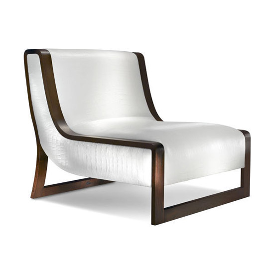
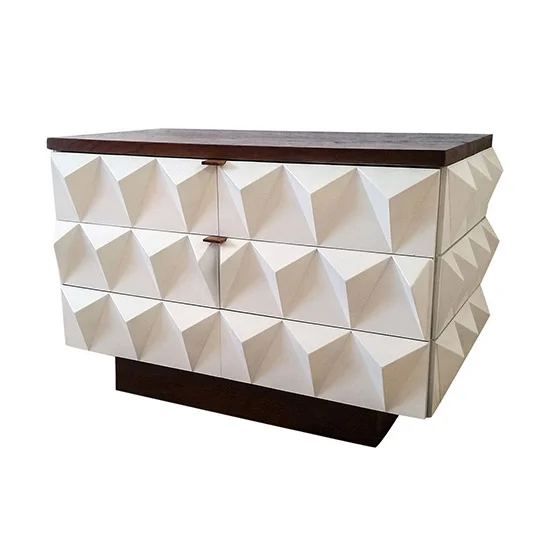
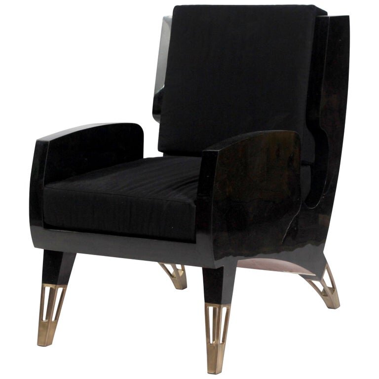
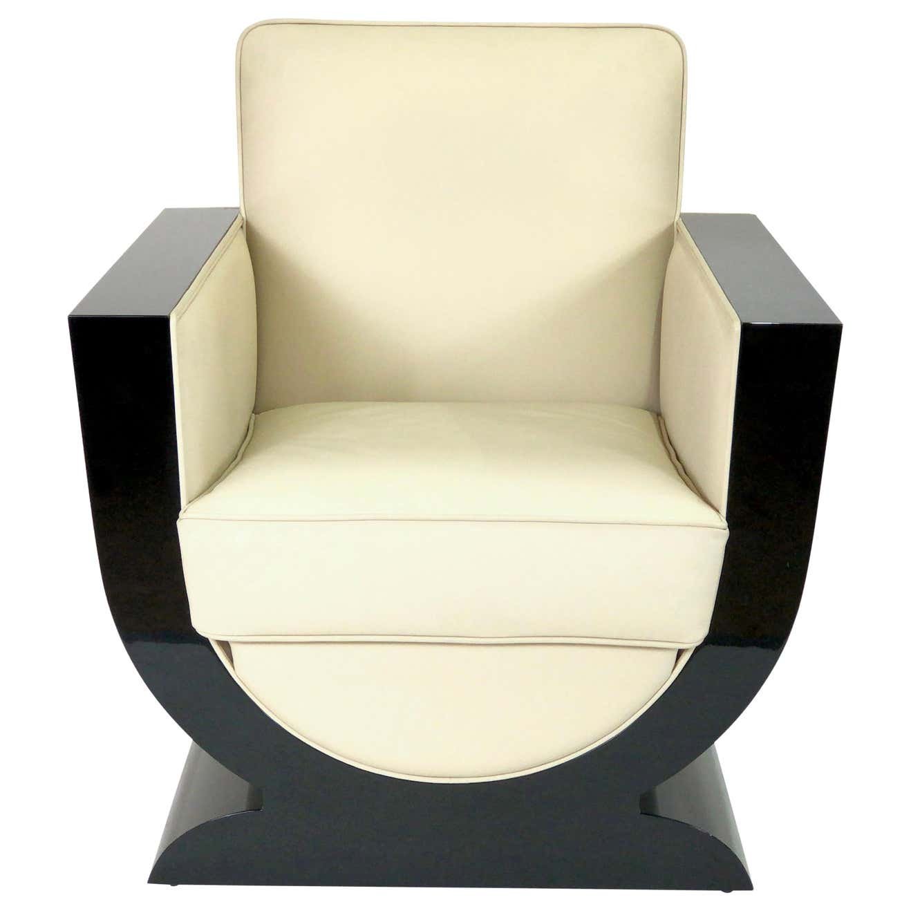
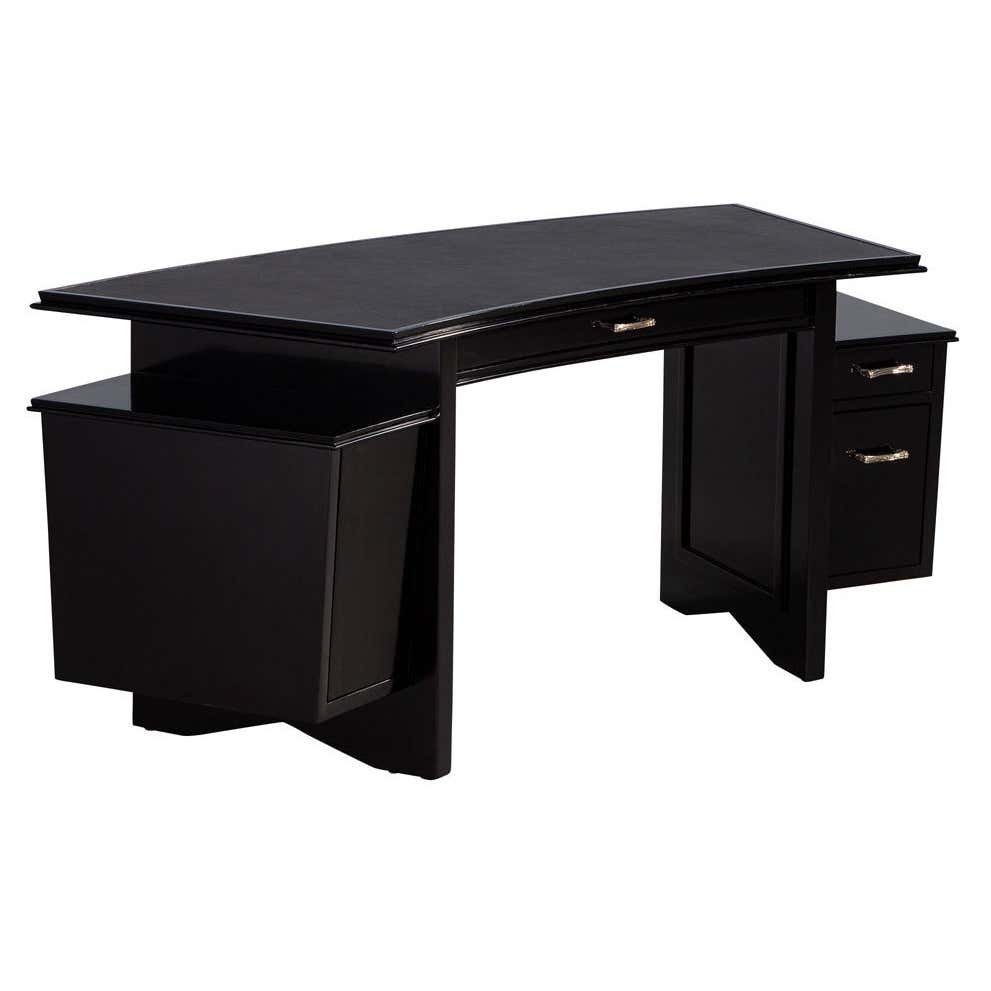
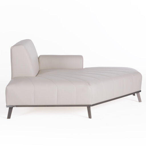
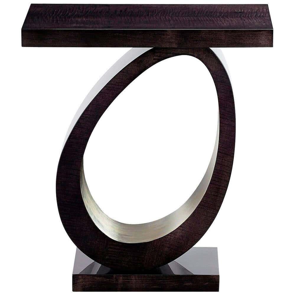
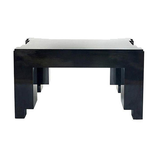
A beautifully tailored apartment where you have to really think about the use of materials, the different forms and shapes, and the types of furniture, as well as bringing in art and texture to create a graphic quality.
The room is Inspired by the composition of a black-and-white photograph, it is important to approach the layout by reviewing how each object sits in relation to the next. Central spaces should be brightened with custom plaster striated white walls. Cerused oak adds warmth to the room and door surrounds, while metal and stone elements balance the softness with structure. Make sure everything felels very handcrafted. Give an extreme amount of attention to detail. The room needs tto be sleek; not to be slick.
When you’re doing a design that doesn’t have a lot of pattern or color, you need to find more interesting ways to catch your eye,
Look for those relationships between texture and contrast, other different principles of black-and-white relationships, and then find specific pieces that fold into that narrative,
Black, gray, and white can be very repetitive so you have to find different applications of those colors in different textures, finishes, and put them together in a way that is meaningful.
There’s a way to find a balance with everything.


