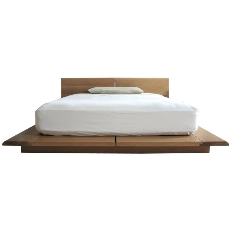
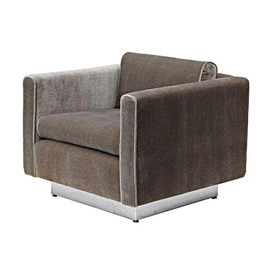
Inspired Look : Minimalism
Less is more may sound like a cliché, but with the minimalist design trend, that’s the essence of this school of design. As a design movement, minimalism is still relatively new, having only come into its own in the late 1960s and early 1970s, particularly with American visual art.
Minimalism, in stark contrast, takes form, color, and space and reduces them to such simplicity to attain their essential nature. At this point, the philosophy goes, one can’t remove anything else from the design to improve it further in any way, shape or form. That’s when you know that true minimalism has been reached. Call it a form of design nirvana where bliss in design is attained by removing all of the excesses!
This aesthetic emphasizes minimalist mainstays like:
Simplicity in design to serve overall function
Clean lines and compositions
Bright and natural lighting
Lighter and more neutral colors
Natural flooring (as well as nature themes like leaves, trees, etc.)
No discussion on minimalism would ever be complete without a reference to Japan’s traditional culture of Zen philosophy. When we say “Zen” in today’s terms, we often think meditation and calm; however, in design terms, Zen is the epitome of minimalism, especially the way Japanese designers use it.


